Flipping Card
Want to learn how to flip a card on hover? Follow me along!
The final result would be:
The color shades used can be accessed from https://www.schemecolor.com/twitter-shades.php
The twitter icon used can be accessed from https://icons8.com/icons/set/twitter
The link to codePen https://codepen.io/bhadupranjal/pen/JjXdPOM
So, let's get started. follow me along!
Part I: Setting up the HTML
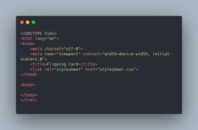
Step 1: Create a new HTML file named index.html and add the basic HTML skeleton to it as shown.

Step-2: Create a new CSS file named stylesheet.css. Don't forget to link this file to the HTML document.
Step-3: First add a parent div with class="card-wrap" to add perspective (discussed later) to the card.
Include a div with class="card" which would further contain two divs:
1. First div for front-face of the card with class="card-front".
2. Second div for back-face of the card with class="card-back".
Here, I am using the twitter icon for the front face with class="logo".
For the back face, I am adding my twitter details.
So, we have completed the required HTML part.
Part-II: Setting up the CSS
Step 1:
(a) Let's first add some common styling.
(b) Add a font-family to the card. I used 'cabin' font from google fonts.
(c) I added a linear gradient to the background.
(d)To center the card we can use flexbox.
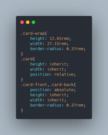
Step 2: Add height, width, and border-radius to .card-wrap. The .card would inherit length and height from .card-wrap. Add position : relative to .card and position : absolute to .card-front and .card-back to stack .card-front and .card-back on top of each other and some other stylings.

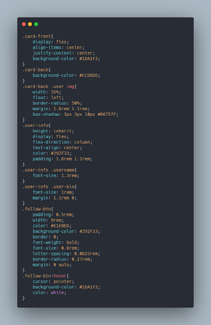
Step 3: Add styling to the front and back faces of your card. I added the following:

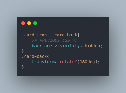
Step 4: We want .card-back to face backward. This can be done by rotating the card about Y-axis by 180 degrees. So, add transform: rotateY(180deg); to .card-back.
Now, the browser window shows the backside of the div but we don't want the backface to be visible. So, add backface-visibility: hidden; to both .card-front and .card-back.

Step 5: On hover we want the card to be flipped by 180 degrees so that the backside of the card is visible. To add the effect we add the following code:
Step 6: Now, you can see that the card gets rotated on hover but it lacks a 3D effect. For this, we need to add perspective to the parent element.
The perspective property provides depth to the element.
perspective: 1000px; adds a depth of 1000px to the element.
Also, add transform-style: preserve-3d; to .card.
Congratulations, your card is now ready!🎉


Comments
Post a Comment